A B2B SaaS tool designed to support cybersecurity managers in the automotive industry with conducting and managing 
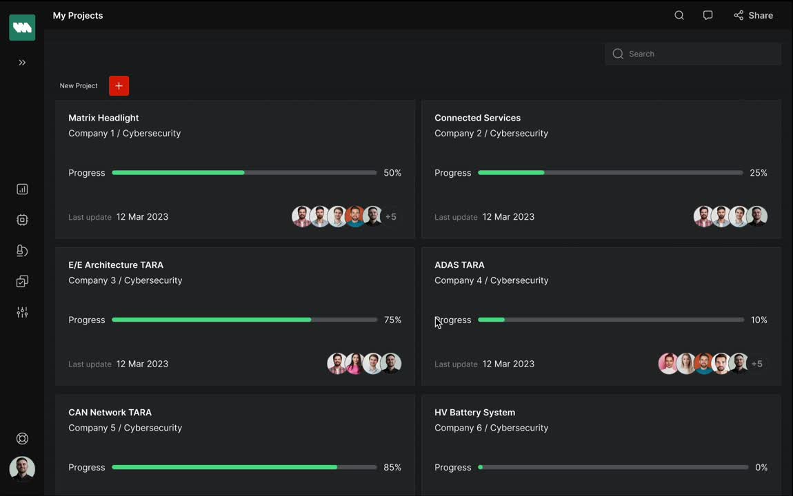
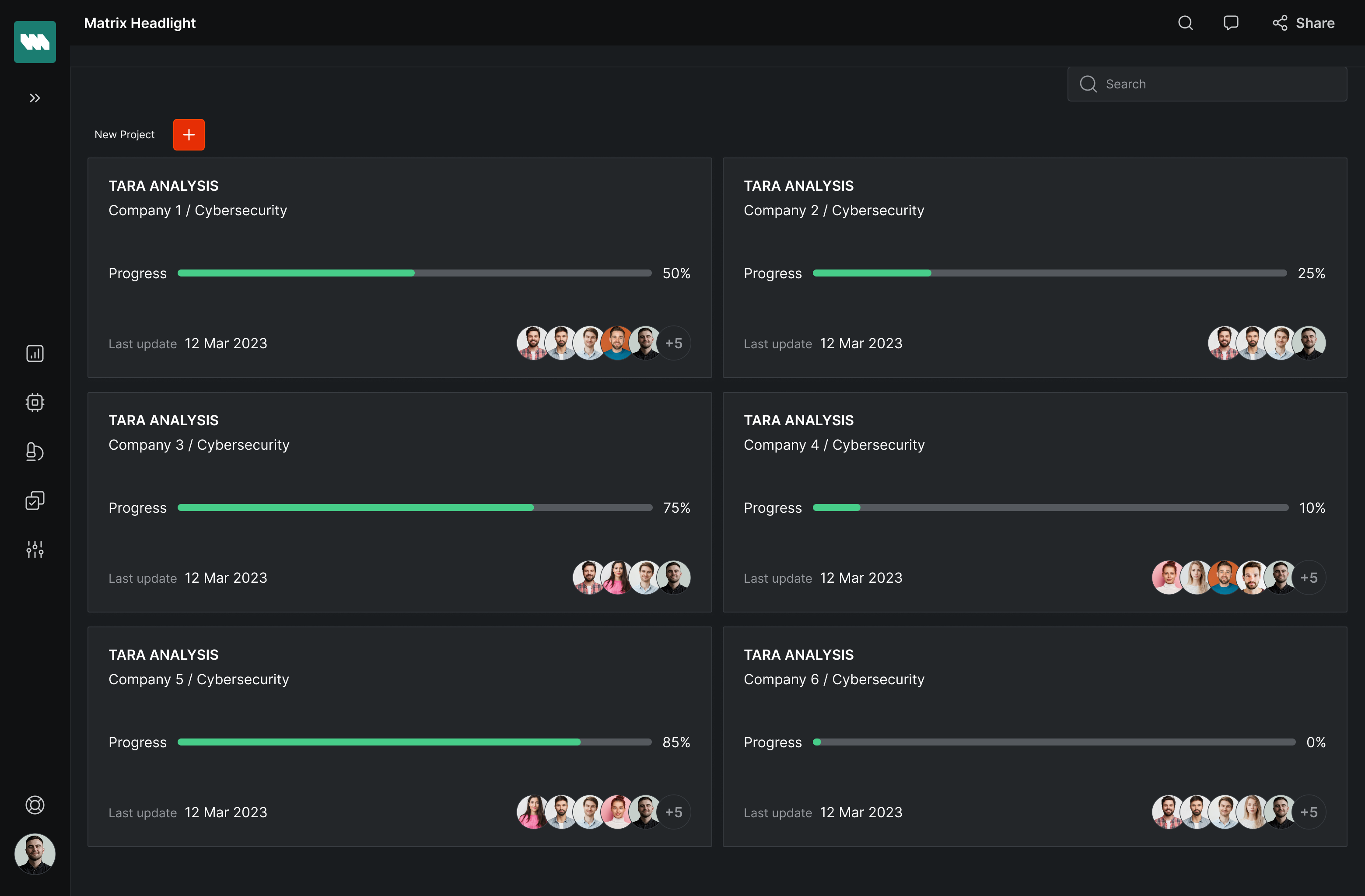
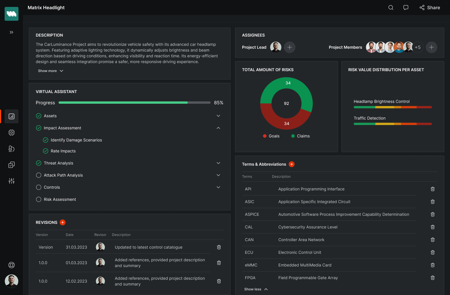
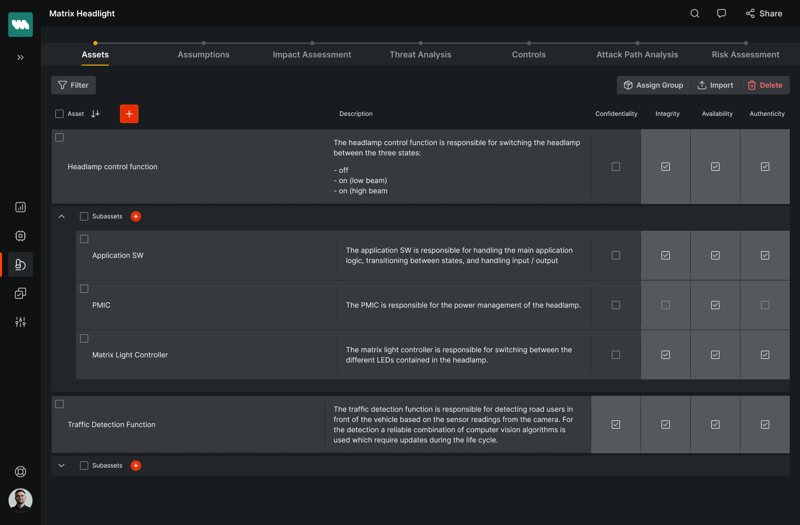
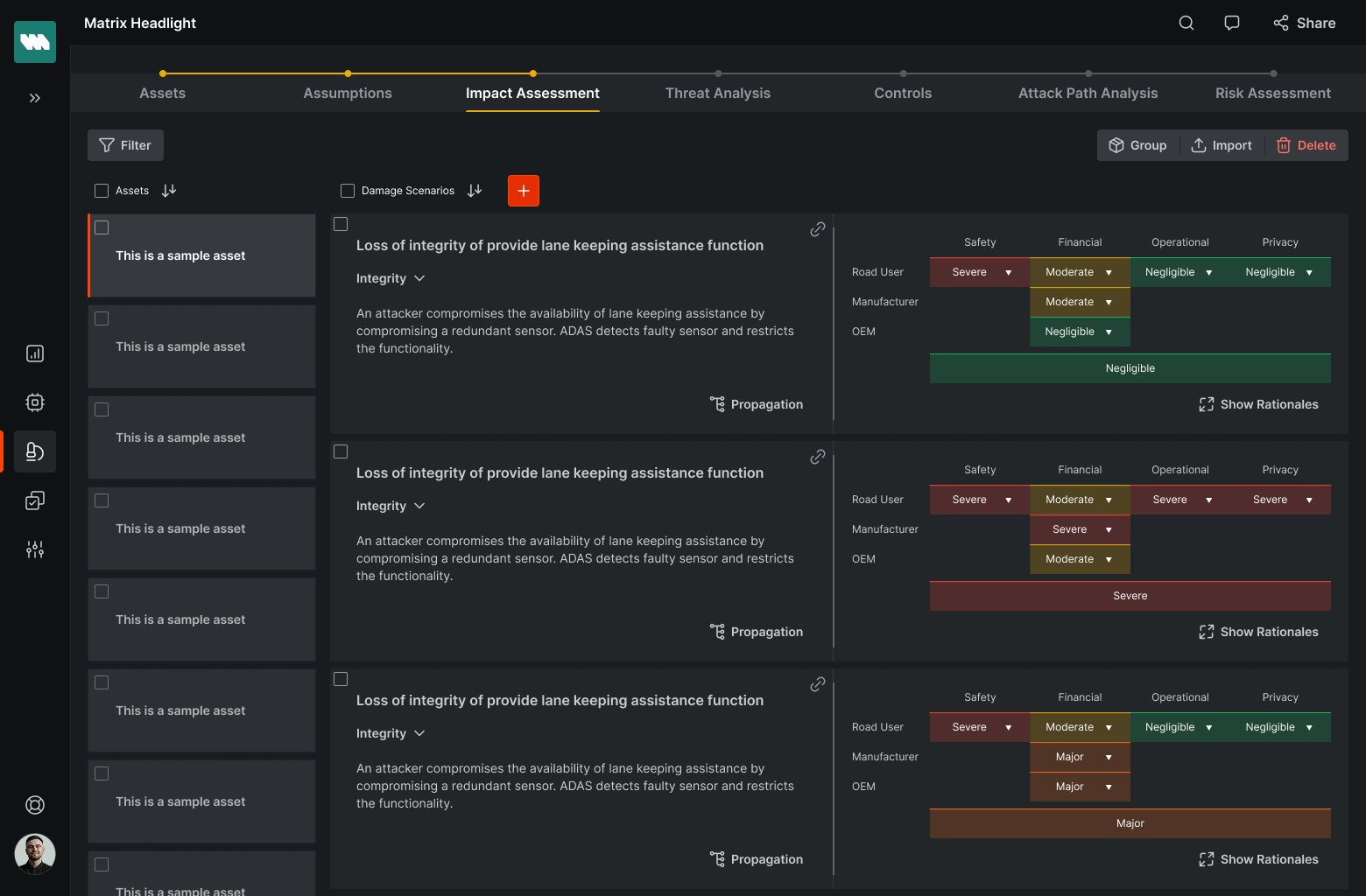
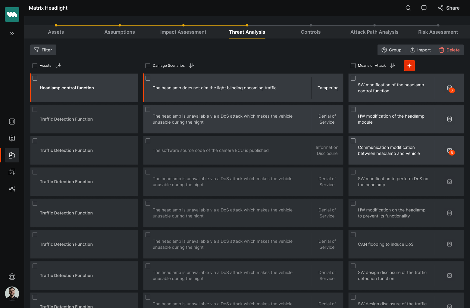
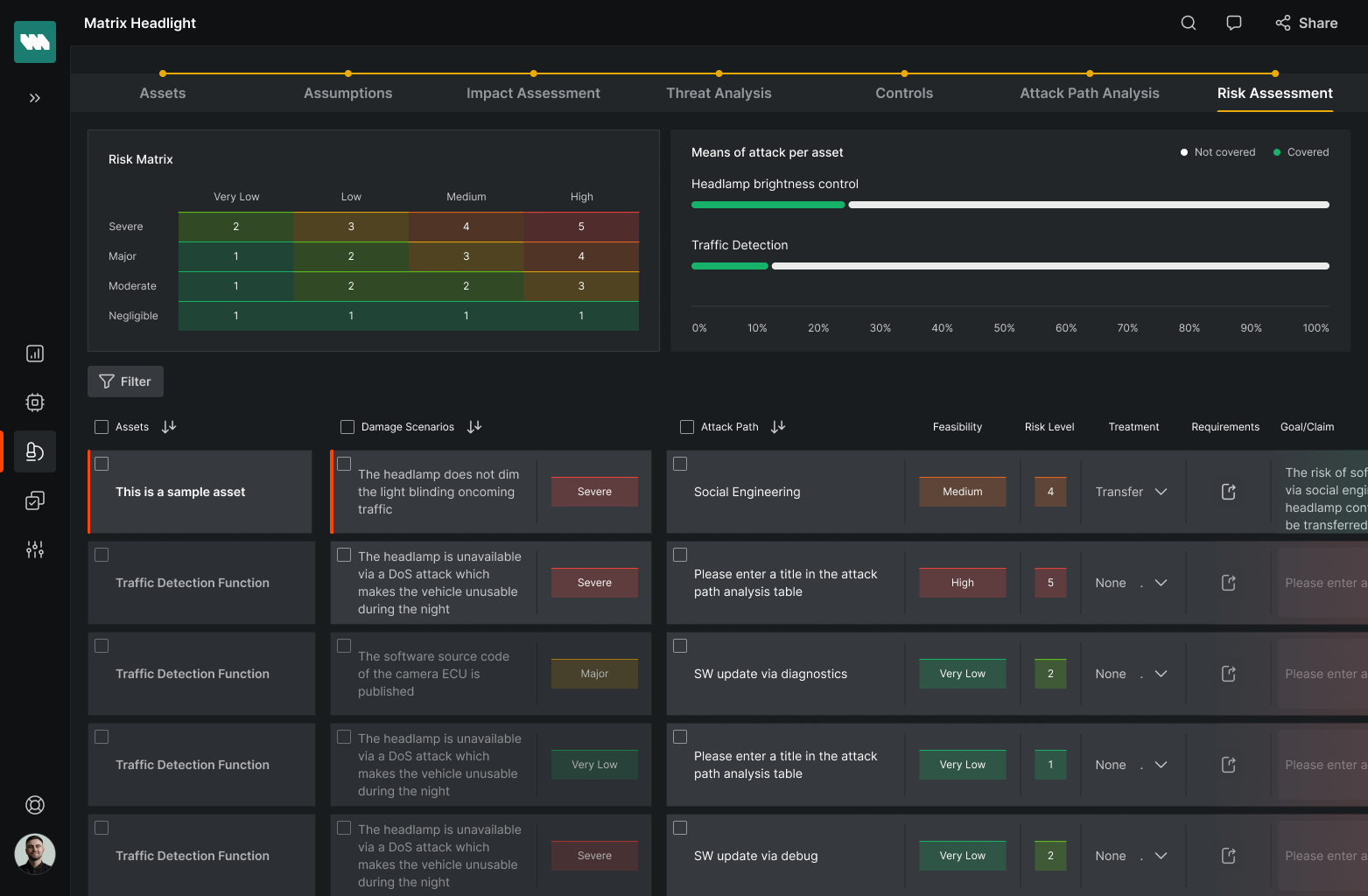
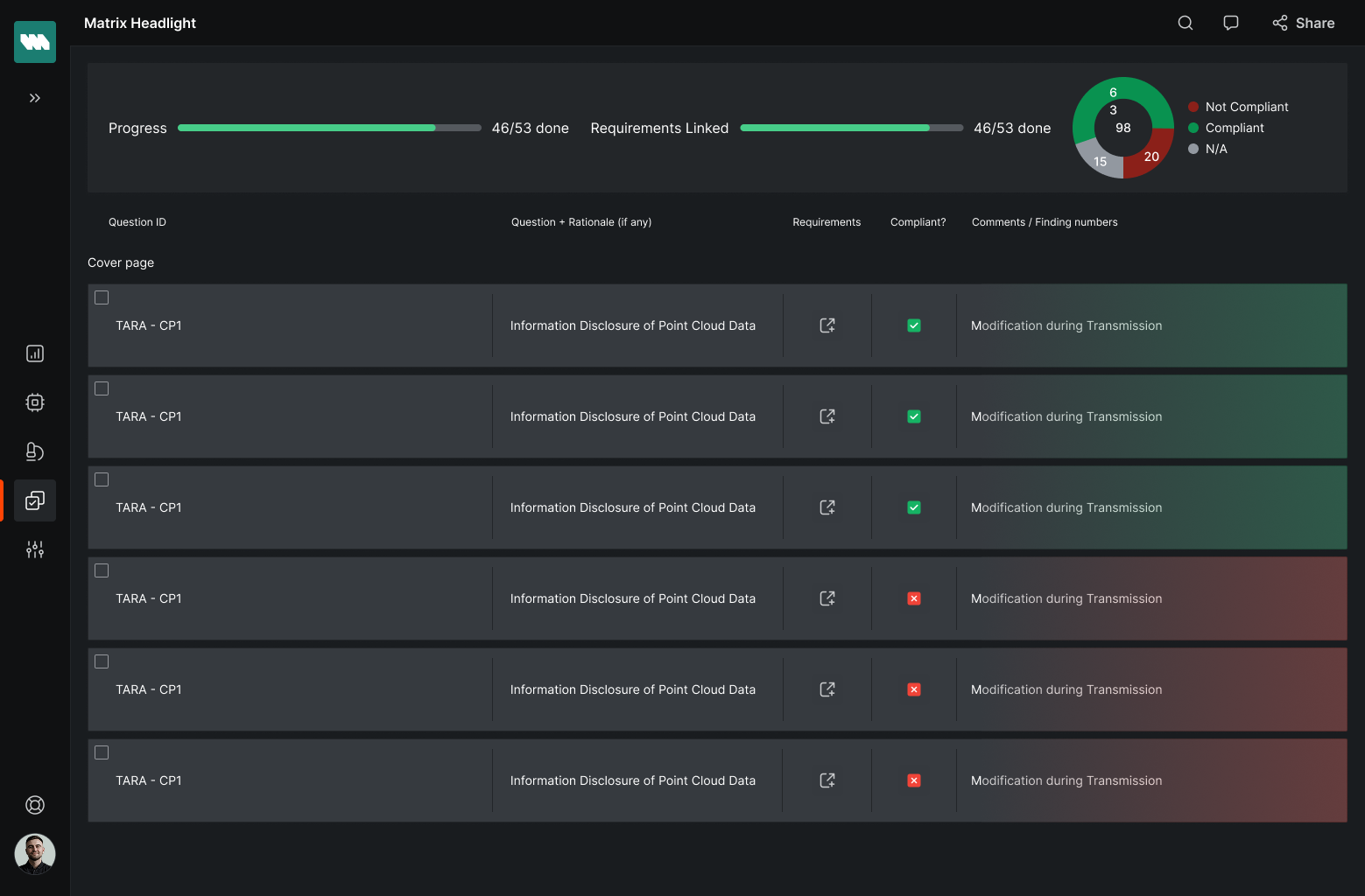
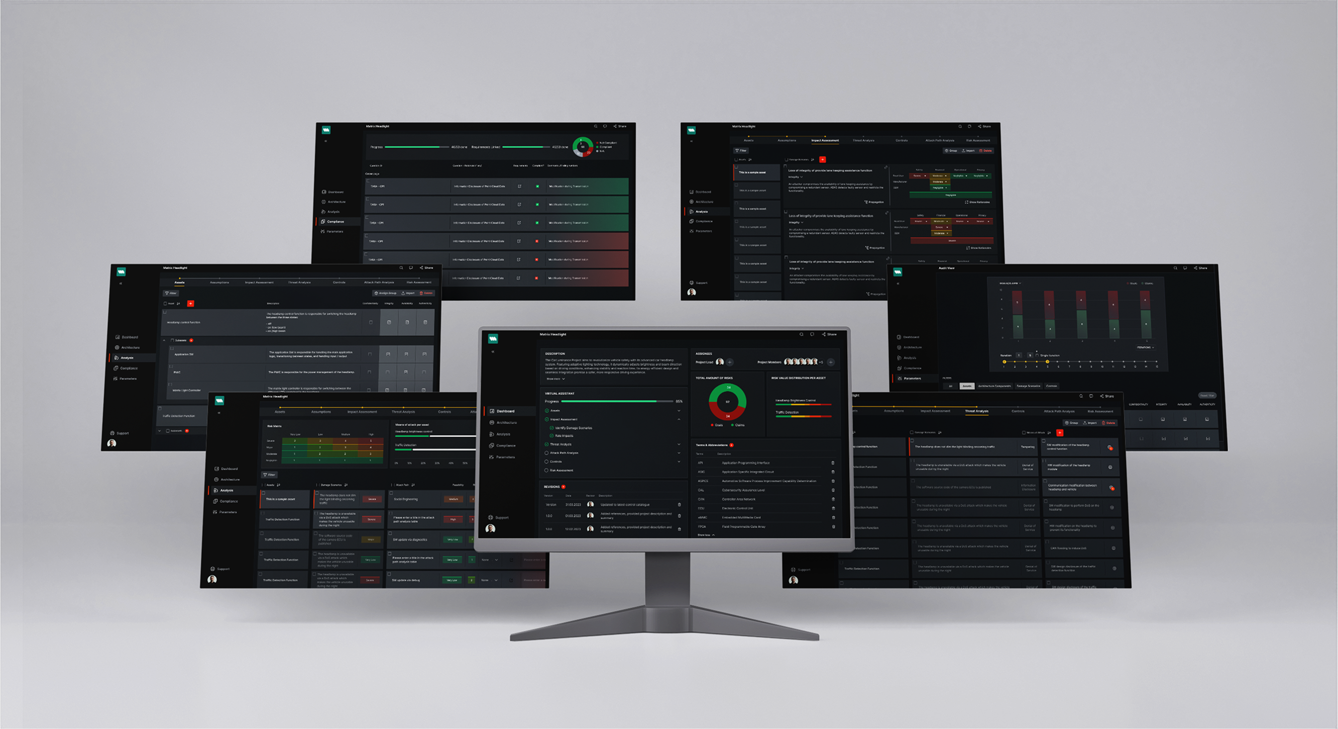
TARA (Threat Analysis and Risk Assessment) processes.
2023-2024
Digital Product design (50+screens for web and mobile (tablet), Clickable prototypes, Dev Handover documentation, Design System, ongoing support for product optimizations
On this first stage we had a deep dive technical workshop into the domain with understanding the core principles of the TARA process, its main actors and the target users. Afterwards I’ve run a JTBD workshop to better understand target users, their unserved needs and motivations.
Deep-dive workshop
JBTD
Desk Research
After I’ve compiled all our workshops' findings together with the founder, we've outlined a product strategy that entailed our value proposition, target market, ICPs and personas, and how our product is supposed to help them to do their job better. We came up with the list of features and I've mapped high-level user journeys. These activities served as the foundation for new high-level UX concept.
UX Strategy
User Flows
ICPs/Personas
On this stage we've:
- Redesigned the UX/UI of the existing prototype from scratch
- Design UX/UI for a set of multiple complex features
- made UX/UI optimizations based on usability testing
Wireframes
Hi-fi mockups
UI Visual Design
Clickable prototype
Usability testing
Once final mockups were approved, together with my team, we prepared a UI components library & figma tokens. Additionally, we provided an explicit Dev Handover documentation describing all the interactions and user flows.
UI Components library
Figma Tokens
Dev Handover Docs
For me, personally, product design process never ends with handing over final mockups and UX documentation to developers. Starting from the first implementaion round, I was assessing the UX/UI design implementation with continiously providing my feedback and guidance to the technical team.
Once we released our MVP and completed a few rounds of UX/UI optimizations, my team started to work on a Design System. After Design System was released, it significantly streamlined both design and development processes and helped us to scale the product more efficiently.
We started by outlining the key categories for the design system, ensuring a logical and scalable structure for all elements moving forward.
Building on the existing style guide, we unified and expanded the design tokens—covering colors, typography, spacing, and more—to create a consistent visual language across the product.
We reviewed all existing UI components, identifying inconsistencies and gaps. We then streamlined, standardized, and improved these base components to align with the new token system.
Using the refined base components, we assembled composite components that reflect real-use scenarios, improving usability and speed for designers and developers.
We've created a clear and accessible documentation to support adoption—covering usage guidelines, and component behavior examples.
We ran a final quality check, ensured alignment with development, and handed off the system with a shared understanding across teams.